Publications
The Golden Ratio Publication
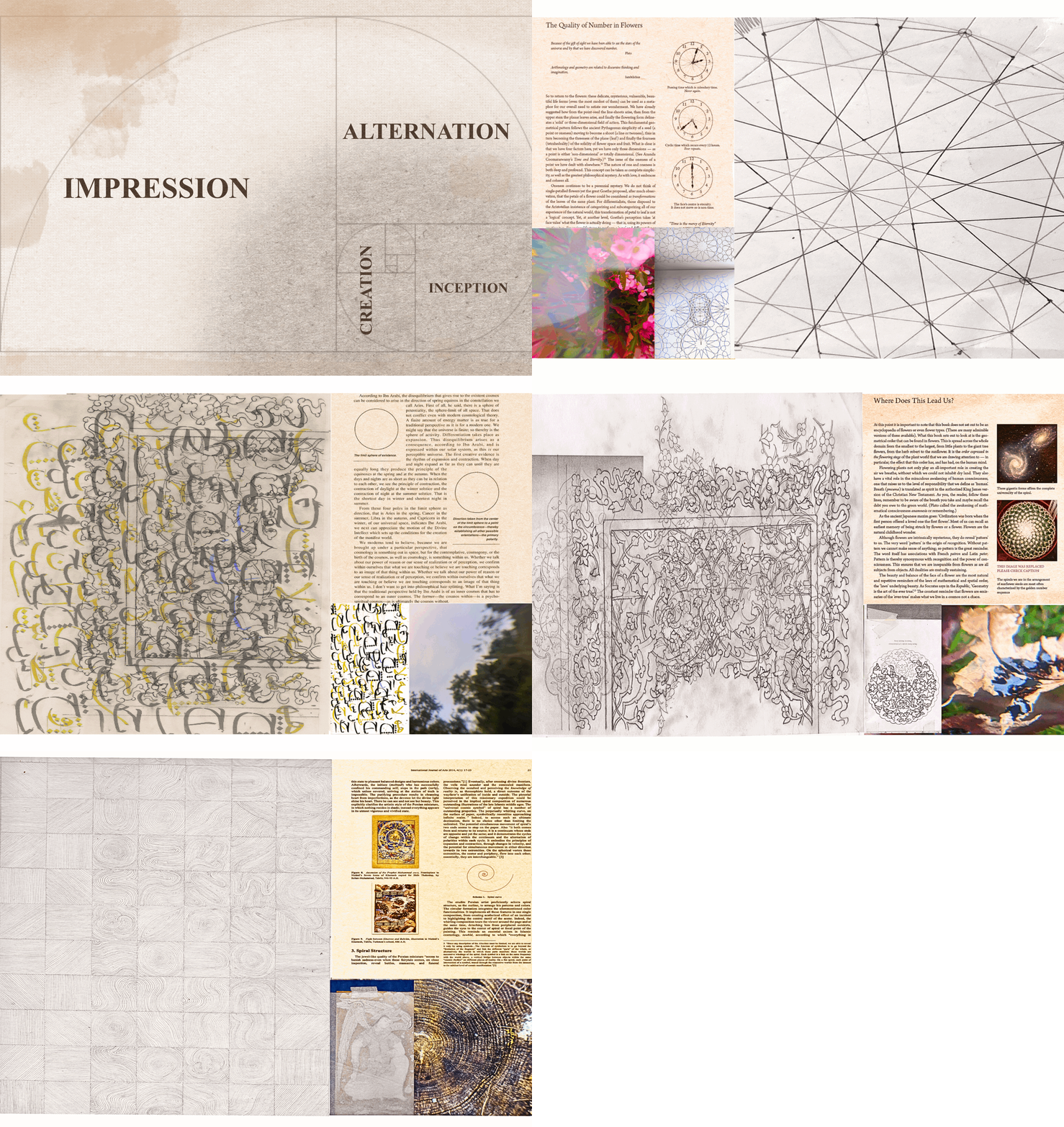
This publication explored traditional Islamic Art through a contemporary lens, reflecting on the inspiration, process, and rituals behind it. With over seven years of training in Islamic Arts, I wanted to highlight the rigorous and time-demanding aspects of these crafts, with an aim to reveal their subtle and delicate features. The goal is to foster 'tazkiyat al-nafs' (purification of the self), facilitating a deep connection between the creator and the art. Only four copies were made of this publication to be sold at Boston Art Book Fair.
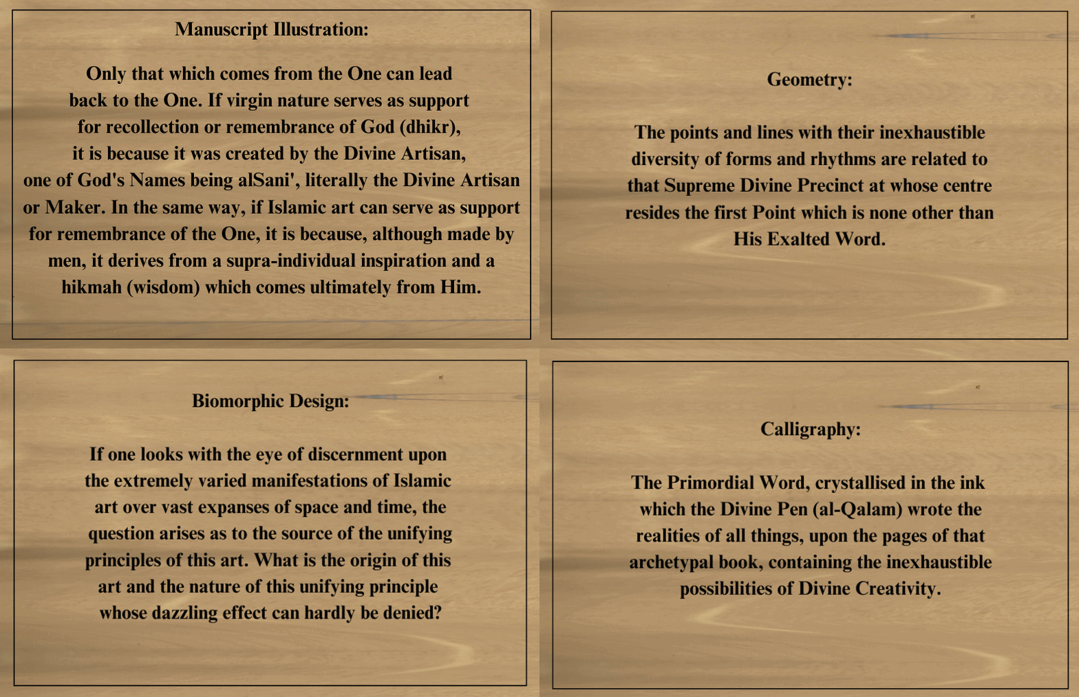
The project focuses on four categories of Islamic art: sacred geometry, Arabic calligraphy, biomorphic design, and manuscript illustration. These arts involve meticulous practices like geometric tessellations, forming Arabic script, creating intricate biomorphic patterns, and integrating these elements into manuscript illustrations.
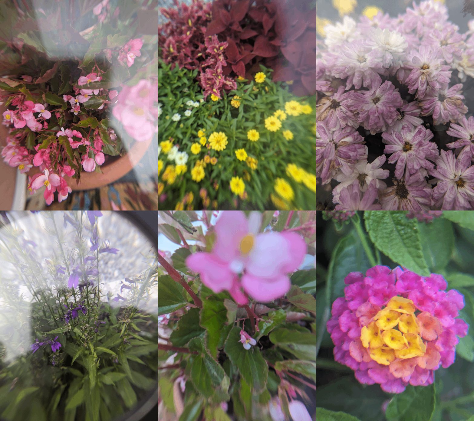
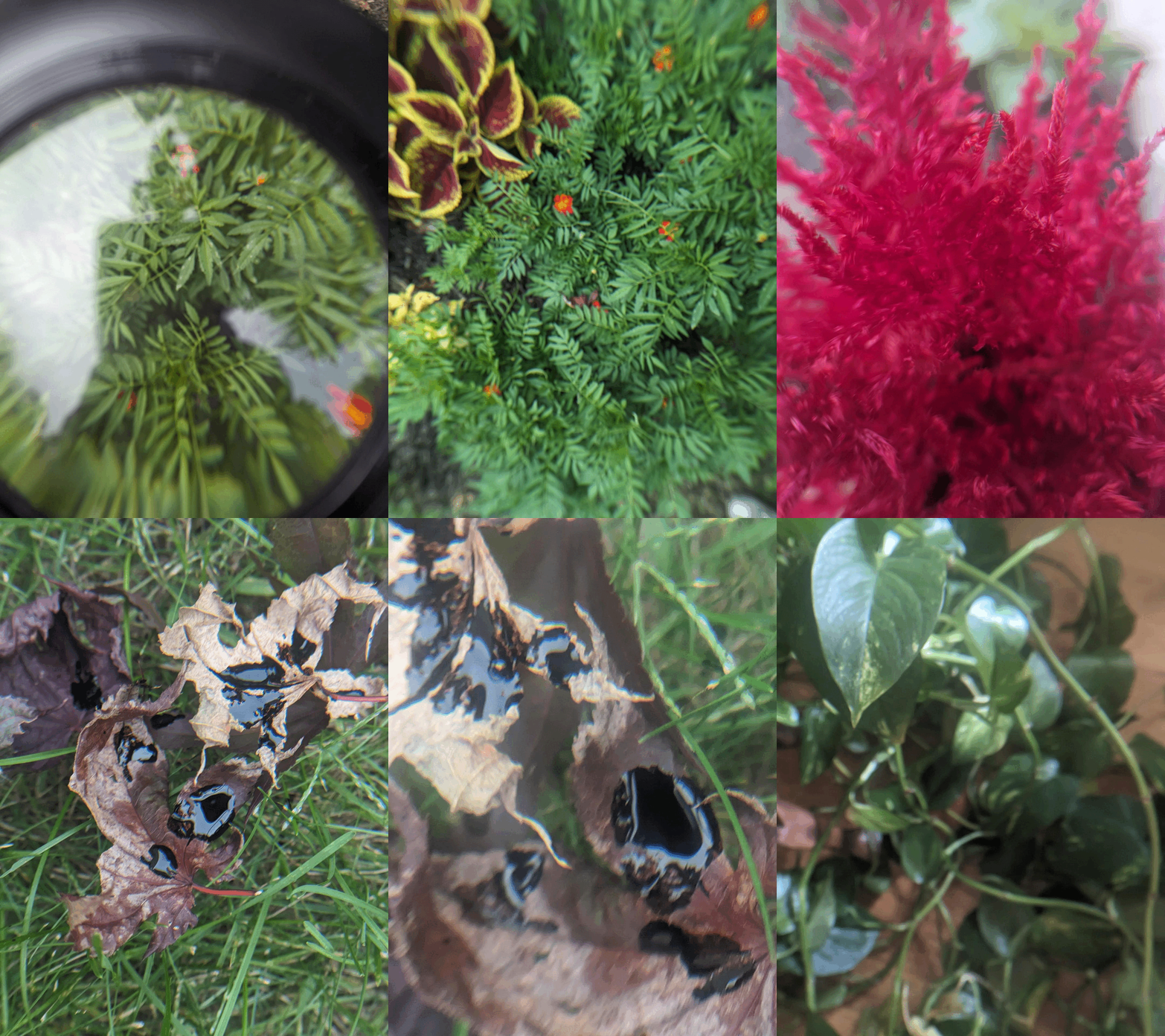
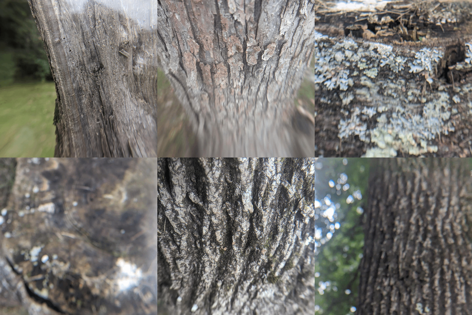
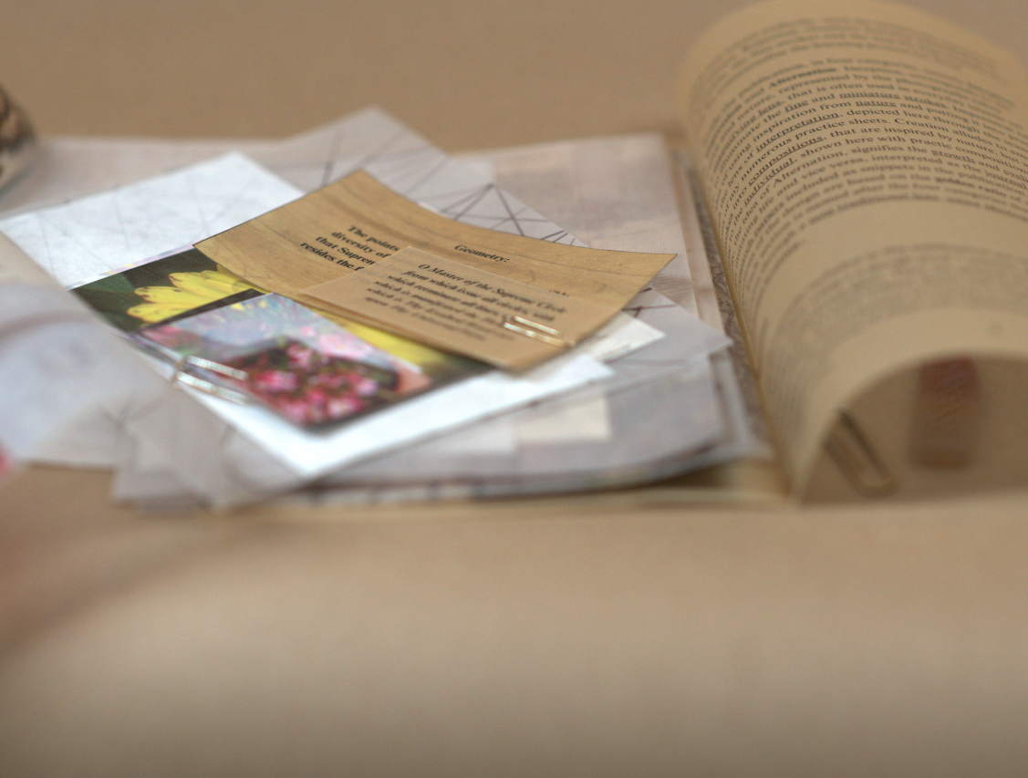
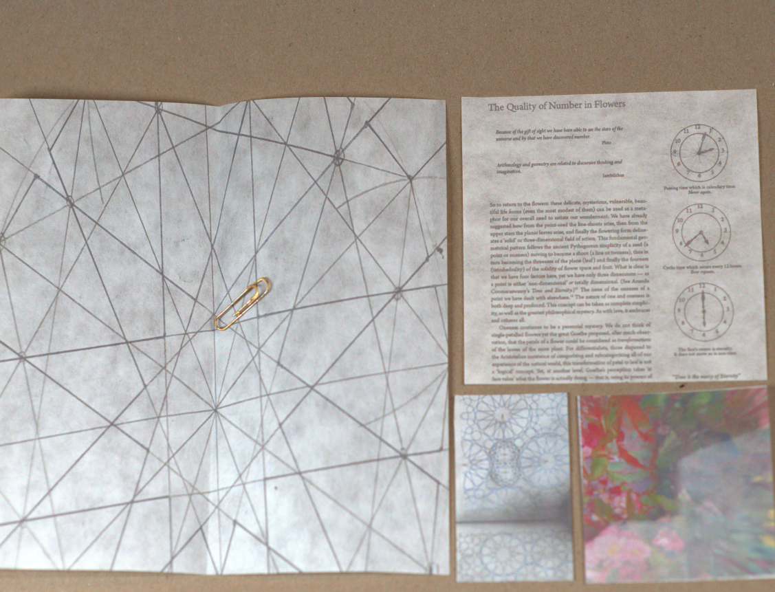
The publication was divided into four sections: Inception, Creation, Impression, and Alternation, representing different stages of the artistic process. It used raw, unedited photographs taken with a Google Pixel 7 camera through a magnifying glass, and printed on HP semi-glossy photo paper. A4-sized vellum sheets and rice paper were used to symbolize the tracing and repetition central to Islamic art practices. The design proportions were based on the golden ratio of an A4 sheet, enhancing the visual harmony of the publication.
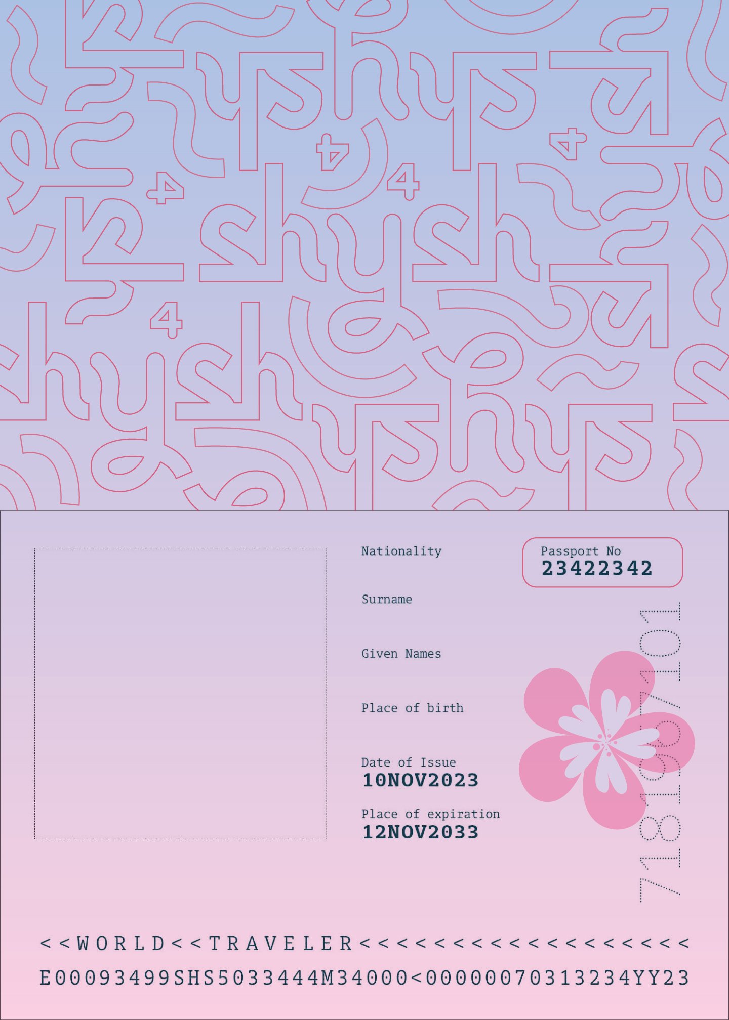
Collective Publication: Shysh!
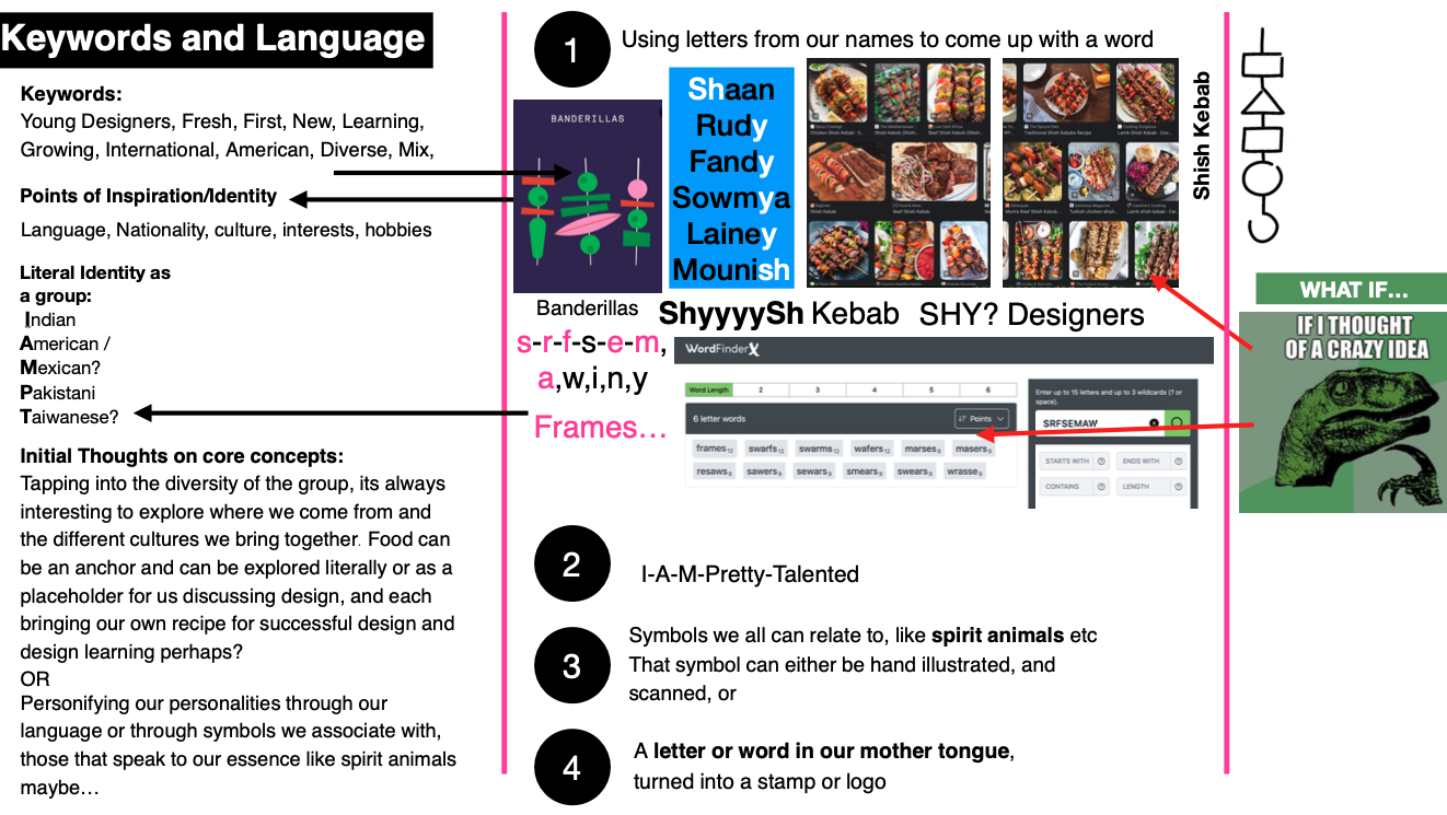
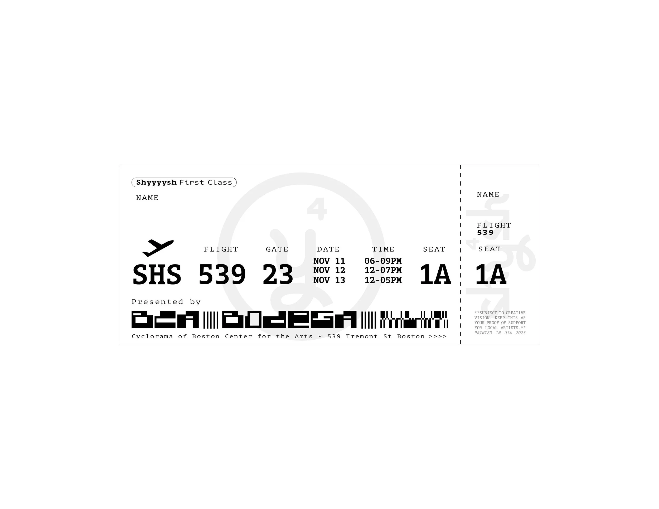
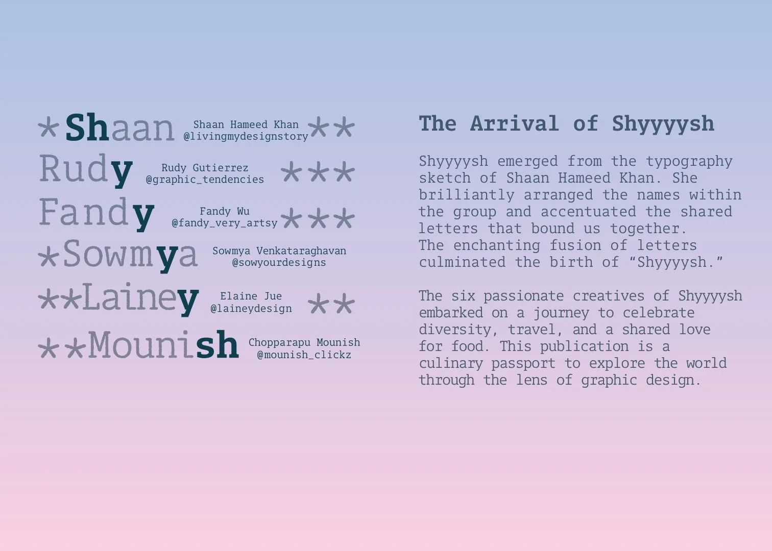
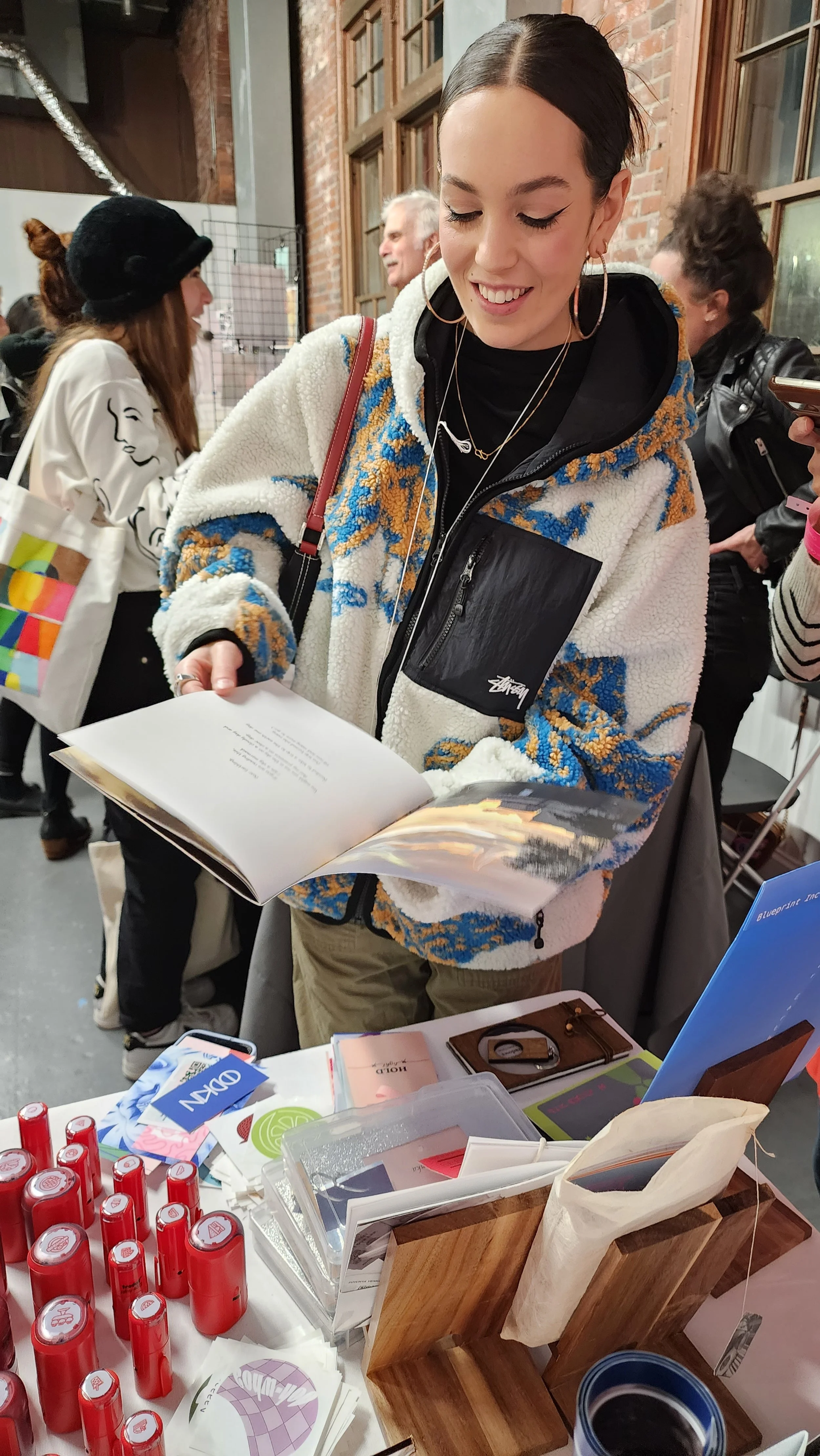
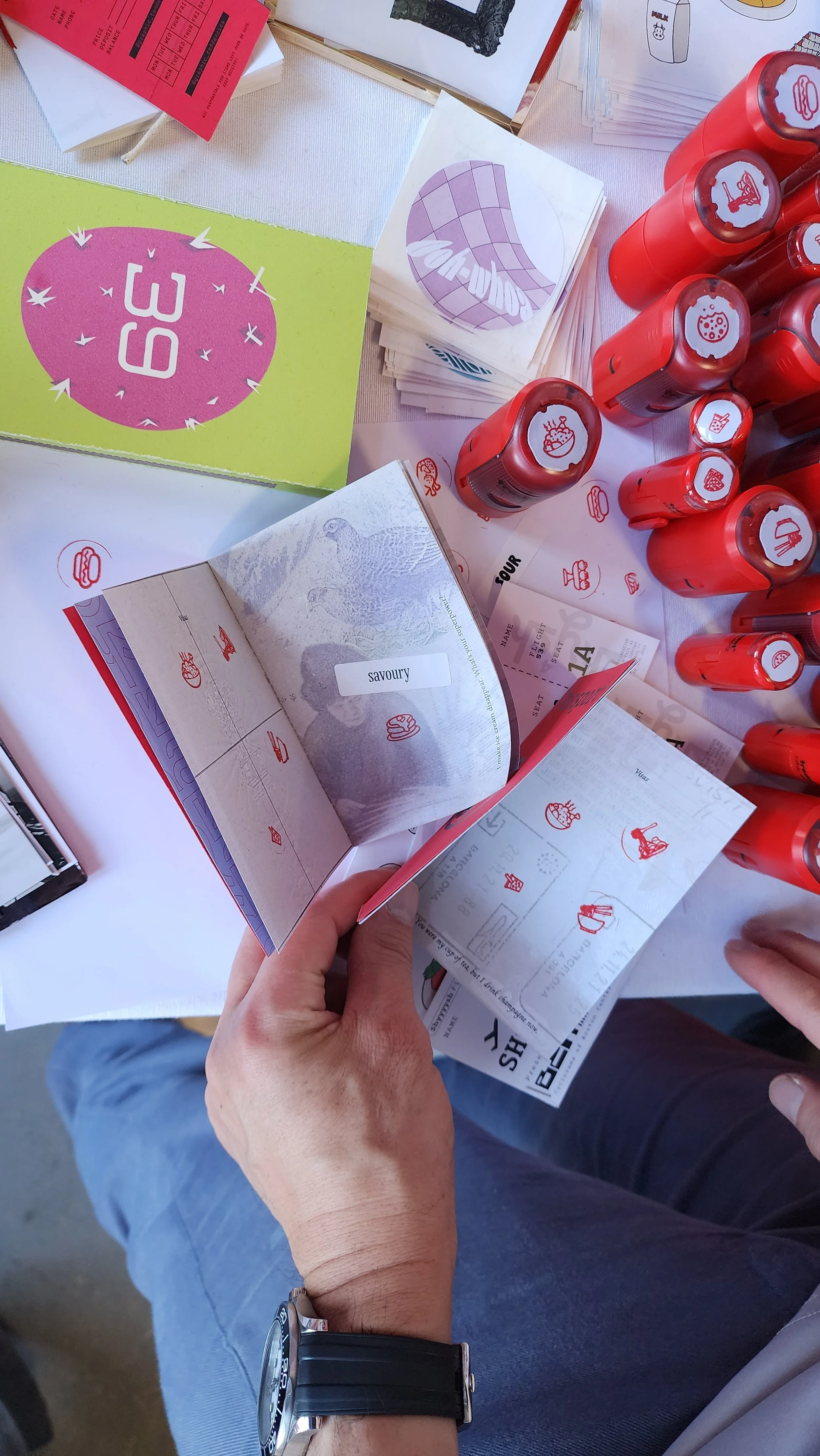
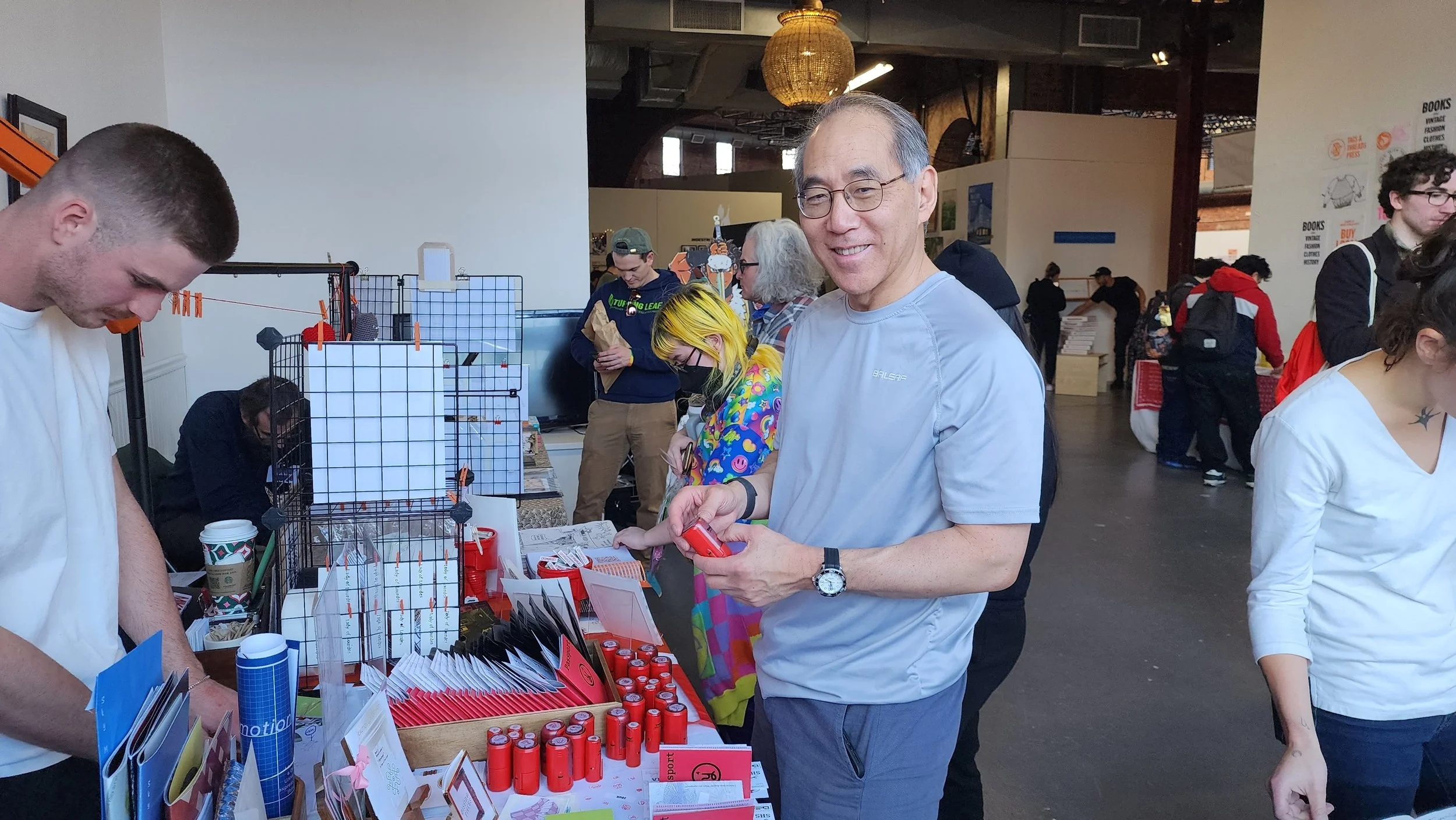
For this collective project my classmates and I had to come up with a publication idea to present for our table at the Boston Art Book Fair. I came up with a process to name the publication which then drove the idea for the publication itself. Besides being credited with the main idea for the publication in Suffolk University’s newspaper, I also had the pleasure of creating the food icons that then were converted into stamps that were used as a design extension for the passport publication.
I used the letters from our collective groups name to come up with the idea of SHYSH! and the idea of shysh kebab spearheaded the idea of food connecting our diverse identities!
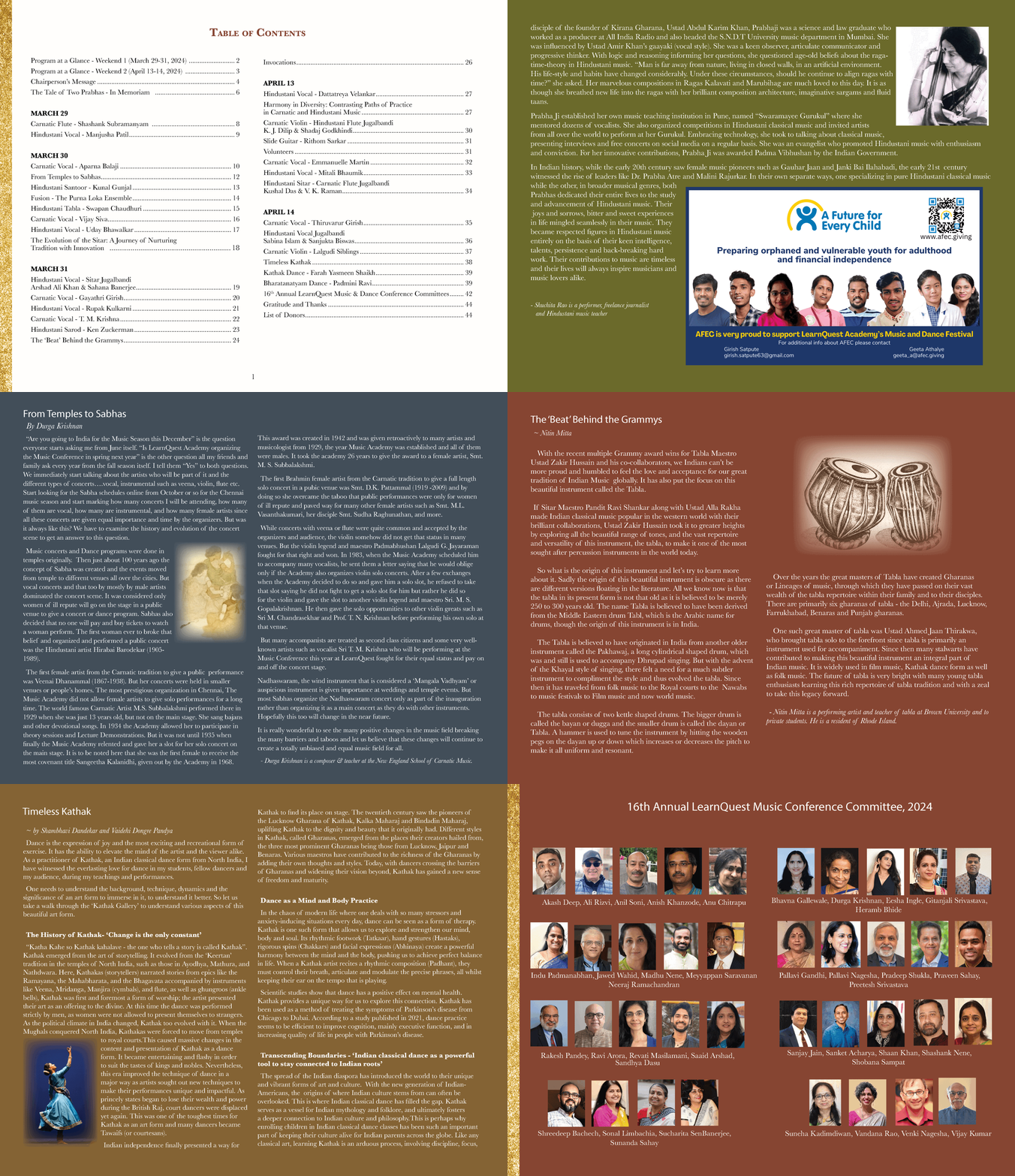
Newsletter feature on my work.
Wikibook
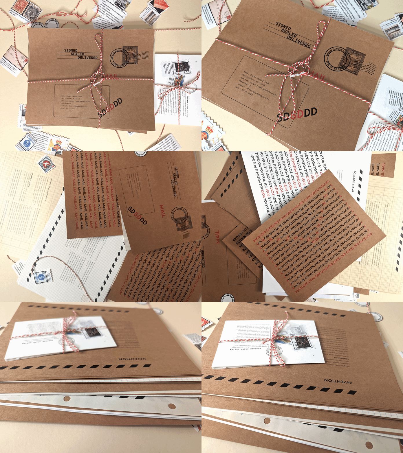
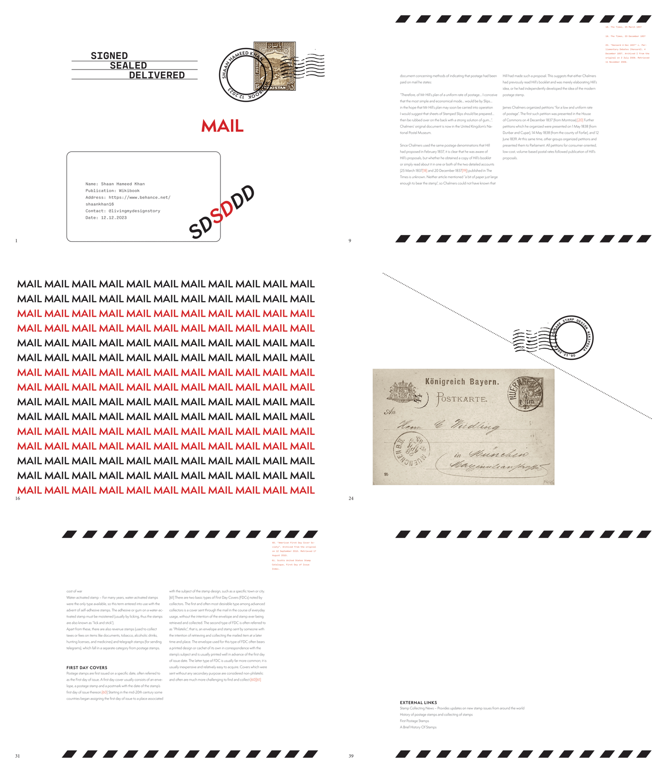
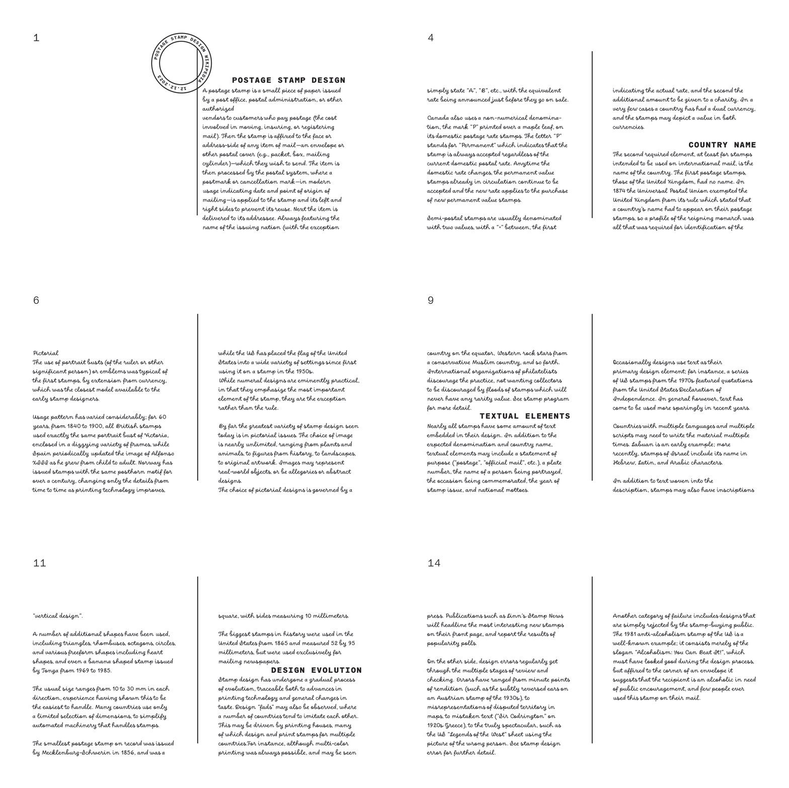
This project involved creating a publication inspired by a selected Wikipedia topic, which in my case was “Postage Stamps” with a heavy focus on typography. The publication included a title, contents, links, headers, body copy, captions, sidebars, footnotes, call-outs, pull quotes, pagination, and a colophon. Key considerations were user experience, legibility, and visual contrast, including contrast of scale, weight, direction, space, form, and texture. The publication was bound and considered page size and paper stock, aiming to maintain a consistent voice with potential annotations.
Phase 1 entailed conducting type tests with at least one workhorse and optionally one display typeface, defining a typographic system with hierarchy in mind, and creating the document in InDesign. This involved determining page size, setting up a grid for structure, and plugging in all text content.
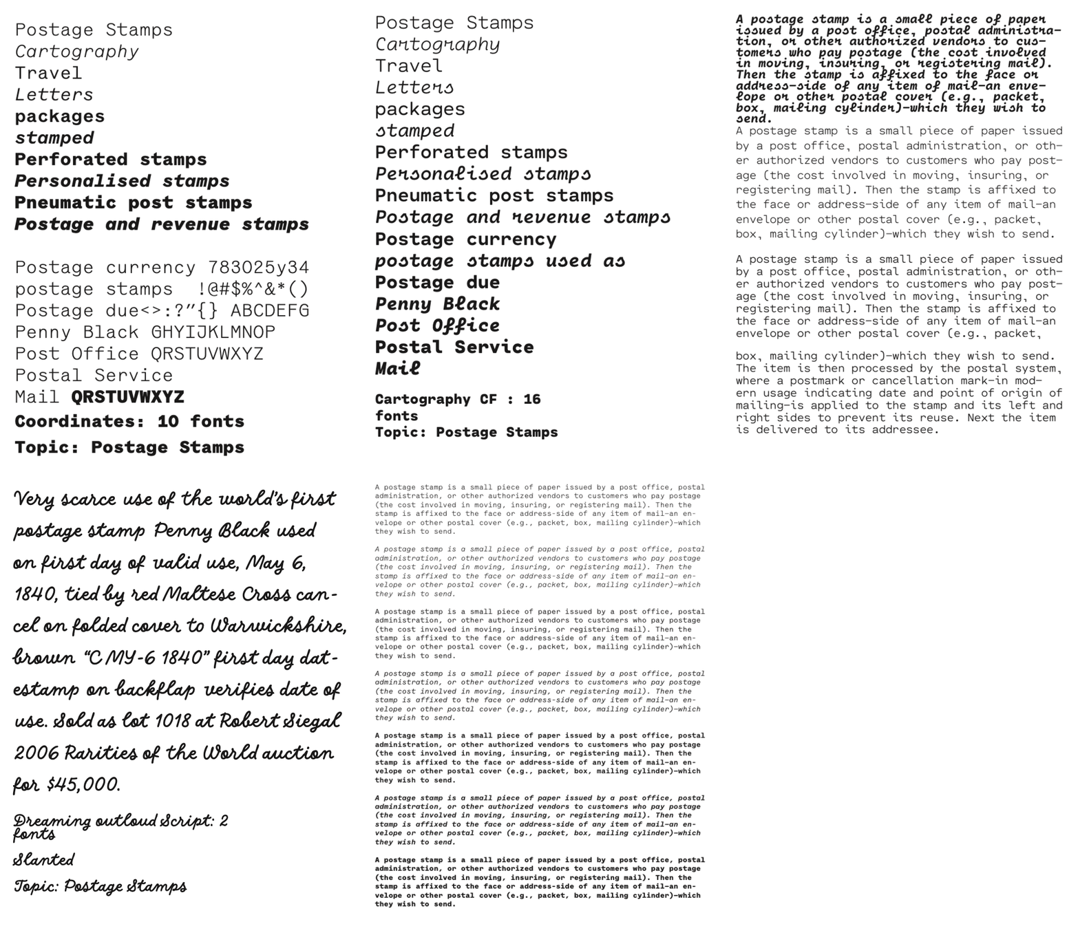
Type Tests conducted.
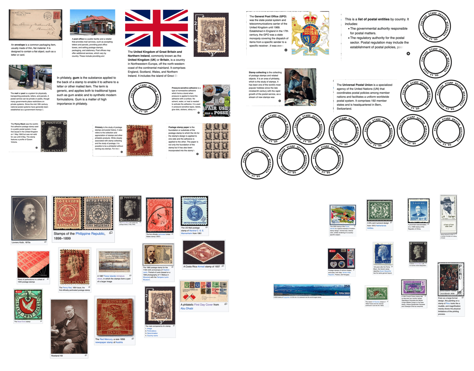
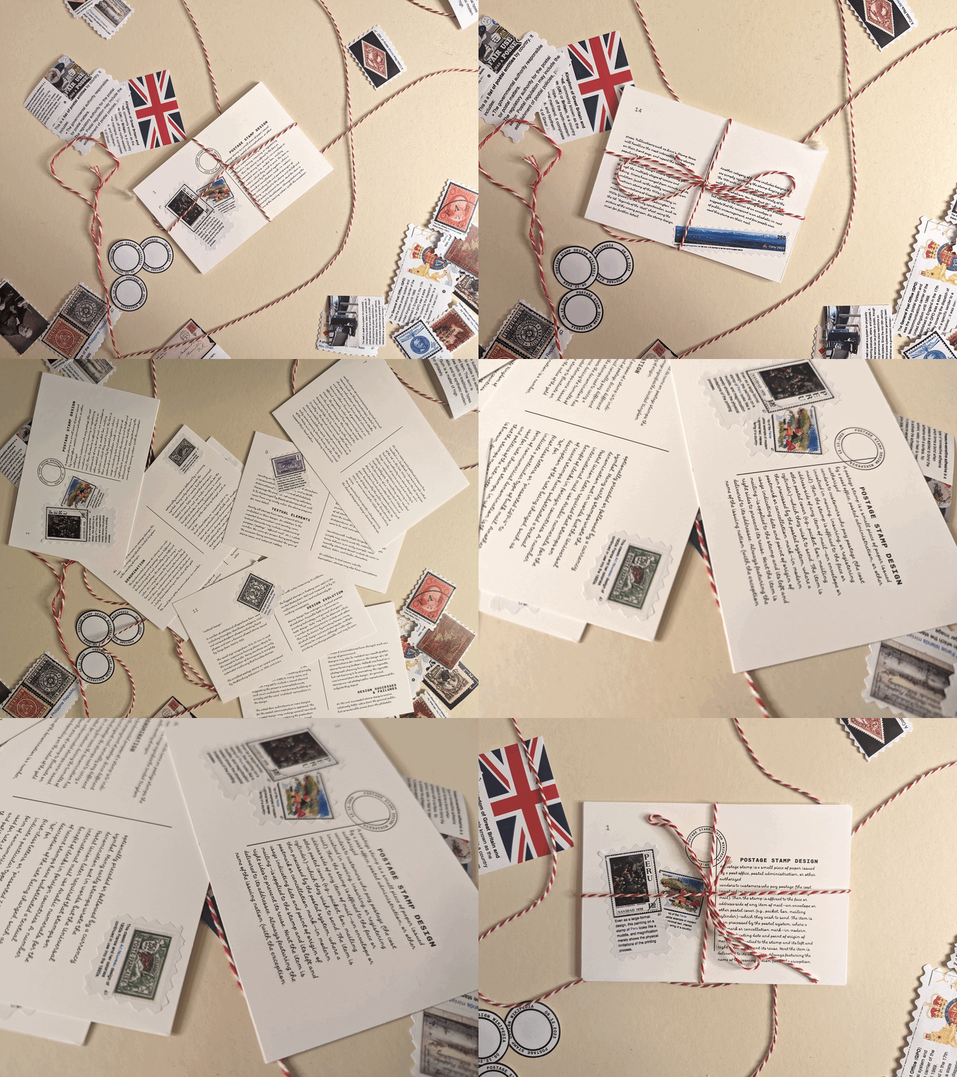
The images and illustrations are taken directly from the wikipedia pages as screenshots, that were then re-arranged and printed on sticker paper and layered over the content to evoke the language of postal marking, signage, and stamps.
The publication consisted of two portions. One was a larger A4 sized document and the other was postcard sized. I selected three fonts to blend vintage and modern postal themes:
Dreaming Out Loud - Reflects the traditional letter-writing era.
Coordinates - A monospace font for titles, contents, links, footnotes, and callouts, reminiscent of classic 19th and 20th-century postal service paraphernalia.
Semplecita - A sans serif font for body copy, captions, pagination, and the colophon, linking the historical essence to a modern, technological postal language.


